

i was gonna have the t-shirt digitally printed here:
-
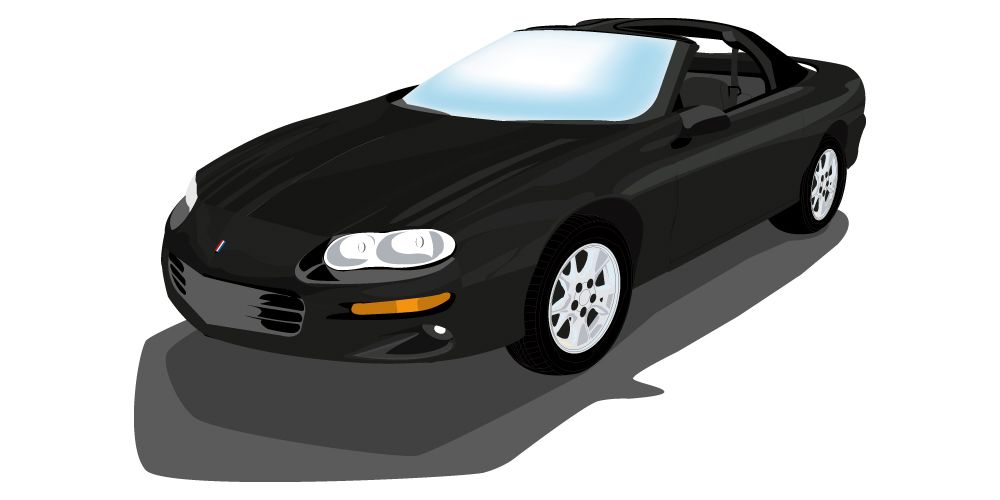
probably another 4-6 hours to go just to get all the panels completed. Add touch up and finalization on top of that. Would like to get the 318 vector to the level of this one I did of my Camaro that I had a few years ago. 15 hours total on this one.
Leave a comment:
-
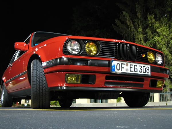
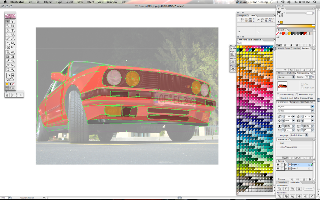
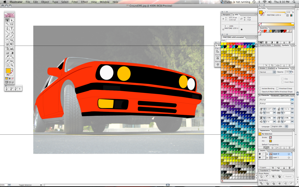
Yan-3 I'm in the process of vectorizing my car as well... I'd like to find a screen printer to have that put on a shirt. 4 hours into this so far and this is as far as I've gotten. (Keep in mind, each point is 1 mouse click lol)
Leave a comment:
-
-
my plan was never to make t-shirts to mass sell. i just wanted to make a one off for me. im in canada remember, shipping would not be that interesting to you guys.
but if anyone is willing to pay about 35$ for the t-shirt...Leave a comment:
-
I second that notion! Took about 3 hours total to get it that way... could charge ya $150 or 1 shirt lol :hitler:Leave a comment:
-
Tim is the MAN!!! now when can we expect these shirts? I say he gets one for free!Leave a comment:
-
I like the "old school" E30 one better with the entire horizontal line of the 'e' dark blue like the emblem in post #1. It also flows much better with the openings of the letter 'C' being the same thickness as the horizontal line of the 'e'. The second emblem pictured in post #12 is a newer emblem so I guess both ways are correct. If someone comes up with the finished art I can run the idea to a friend who has a silk screening business.Leave a comment:
-
good work! i did the same thing tho, i recreated the e and c from circles. our logos look pretty much identical.
however, check out the first actual badge picture of this thread. the way the lines are striped is slightly different. the entire horizontal line of the e is dark blue. can you do it that way? i think it would look better.
send the .eps to philipb9 yahoo.ca, please! thanksLeave a comment:
-
Upon closer inspection, I found that one of the reasons the re-created versions up to now don't look right because of the rounded lettering. Helvetica's lettering in the circular forms do not match up no where close. I had to recreate the "e" and "c" with actual circles, then cut some points off the circles and re-joined them to make the individual letters. The tail on the "e" doesn't actually line up with the corresponding tail of the "c" either as you'll see below. Also done with the "n" and "h". The hump on those letters is actually a bezier curve at the top and a circle cutout below. Here's what I mean.
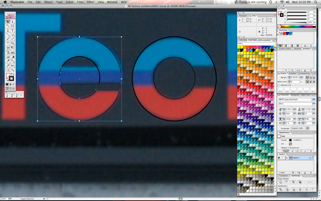
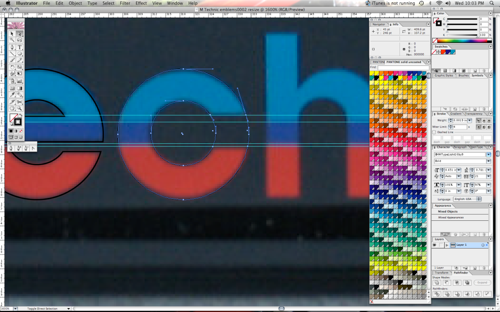
Final Product Screen Shot
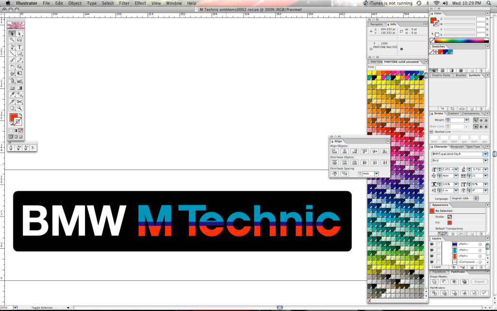
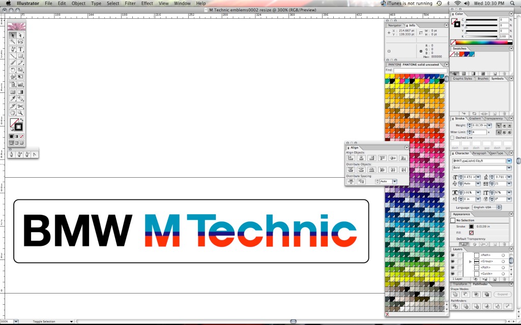
Keep in mind, this does look different on the forum post as opposed to my screen in Adobe Illustrator. The colors are slightly different going from Pantone Process coated to the RGB Scale that is present in the conversion from an EPS to a JPG suitable for internet format.
I can send people the EPS files directly. Don't copy and crop the pics I uploaded as I've touched up a little more since this post I'm sure.
That'll be $125 for logo recreation and a free T-Shirt from the OP. :D
Enjoy!
TimLeave a comment:
-
Just got home from work. I'm going to take a stab at this logo for you nowLeave a comment:
-
-

Leave a comment: