
Why don't you sport one of the 30 sigs already made for you until you find one you like?
-
sigpic -
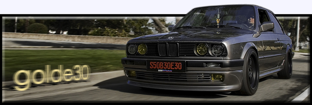
Apparently nobody figured out how to take the line out, so I did it. I'll give you a hint, its a tool in image adjustments used on the line only, feathered slightly. Have fun with the cleaner full size picture, do it up however you want. Any way of getting rid of the cars in the back didnt turn out so hot so I left them and didnt bother turning it into a sig pic myself.
Hmm, unfortunately I cant upload the full full size pic to photobucket where I have it, and it automatically resized slightly smaller but still larger than for a sig. Catch me on AIM if you want to host or just have the full size picture w/o the line.

Comment
-
wow was this a bad attempt ;P *deleted!*Comment
-
Cool idea but needs work. Maybe tey white and blue roundel then fade the white and blue into the rest of the picture, if ya know what I mean. My idea is kinda hard to describe and I can't pshop.sigpicComment
-
Yah, I was just screwing around. I know it needs work, actually it ended up looking like crap :) I actually am just getting back into using PS and thought I could help myself get back with some layering and simple stuff like I had up there.
My primary goal though in this whole thread though was to get rid of that line accurately. Someone else can surely fix up a real sig easier than I can, I just knew how to take care of that problem.
I'll try to see what I can do tomorrow though, maybe even something not so weird. ;)Comment
-
How about this? If I understand you correctly --- The "GRANT" is pretty plain, but could be changed, goes OK with the rest of it though...and the line is gone :D


-JustinComment
-
I'd go with that ^^first one^^, but have the roundel moved over to the left a bit so it didn't block that one e30.
Comment
-
Two more slightly different ones with the gradient. Any version can have The Ultimate Driving Machine or GRANT on them, saving as photoshop files with layers intact. On edit, its brigher and doesnt block the E30's behind the roundel either quite as much.
I'll be going to bed now :oops:


Comment
-
Nice suggestion, Permit. I'll work on it tomorrow if he even wants one of mine and to have it changed. The only thing I'm worried about is if its off center the gradient may not look so great, but I dont know.
Im outa here.Comment
-
I really dig the help guys. The top one is good and if the roundel is moved and my name in a cooler font, that'd be schweeeet. Maybe also instead of using the roundel, you could fade in the PNW logo (see Avitar). Anyways, I really like it. Nice work and thank you.Grant Wescott
1991 Sterling Silver 325iX stock (daily driver)
1991 Black 325i stock (parts)
"Eine Wurst, drei Größe"

Comment
-
Another idea would be get rid of the roundel altogether and fade the blue and white like you have.
You might also wanna add some steam rising out of Grants hood. :P
They are lookin good btwsigpicComment
-
heres one with your PNW logo:

heres one with the logo and a little trickery:

Comment
-
Car looks lopsided. Its funny.
Ill try later. Actually right now.Comment
-
I like it. \/sigpicComment
-
*from page 2*Originally posted by permitIG: @Baye30
FRONT VALENCE IS ZENDER!!! STOP FILLING MY PM BOX PPL!!!Comment


Comment