Quick Edits

Collapse
X
 
  • Time
  • Show
Clear All
new posts
  • 5Toes
    Banned
    • May 2010
    • 9836

    #1

    Quick Edits

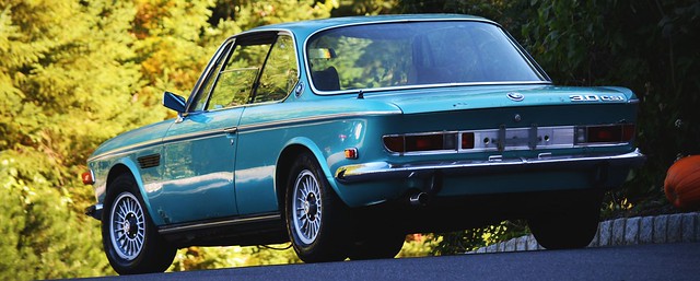
    Okay so I threw these together earlier today. Can anybody give me some advice on them. Do they look good or bad? Im trying to learn photoshop but... yeah

    Done in GIMP - Original - http://www.blogcdn.com/www.autoblog....es-m-coupe.jpg
    Attached Files
  • 5Toes
    Banned
    • May 2010
    • 9836

    #2
    Any feedback?

    Comment

    • White325is
      R3V Elite
      • Oct 2006
      • 5947

      #3
      remove the guys hand.

      Comment

      • Matt-B
        The Waffler
        • Jun 2009
        • 3856

        #4
        yea it looks like skeletor is driving


        Please leave feedback below, thanks

        http://www.r3vlimited.com/board/showthread.php?t=358170

        Comment

        • 5Toes
          Banned
          • May 2010
          • 9836

          #5
          Then it would still be good? I know the borders are messed up

          Comment

          • VasFinest
            Grease Monkey
            • Nov 2010
            • 372

            #6
            I would prefer the shots without the diagonal that runs along the middle/over the roof.... and the border is meh... I like the actually color editing and what not, but I don't really see what the point of the edit was, it seems like there is no clear focus in the editing. If the focus is the car, then the editing detracts from that. But thats just my opinion! What do I know anyway?
            Originally posted by ak-
            Support is where it's at. Like a bra. This guy has his bra off though. He lives dangerous and shameless; i like him.

            Comment

            • 5Toes
              Banned
              • May 2010
              • 9836

              #7
              How would I point the focus more towards the car, and yeah the line does look dumb, this is the wrong type of shot to use that.

              Is my border idea good, where I inverted the colors with white overlay?

              Comment

              • VasFinest
                Grease Monkey
                • Nov 2010
                • 372

                #8
                Border is a good idea, but it seems out of place to me for this shot, I think if you take the original shot, do just the color corrections you did, and lose the driver's hand somehow, it would look much better.
                Originally posted by ak-
                Support is where it's at. Like a bra. This guy has his bra off though. He lives dangerous and shameless; i like him.

                Comment

                • bp9129
                  E30 Addict
                  • Sep 2009
                  • 565

                  #9
                  Remove the line and the borders.


                  ]Real sht

                  Comment

                  • Peterkaczynski
                    R3VLimited
                    • Nov 2008
                    • 2587

                    #10
                    try a simple black border and remove the lines


                    e24 e9 e30
                    IG: peterkaczynski

                    Comment

                    • 87e30
                      R3V Elite
                      • Jul 2008
                      • 5676

                      #11
                      Too dark in my opinion.
                      Originally posted by z31maniac
                      I just hate everyone.

                      No need for discretion.

                      Comment

                      • 5Toes
                        Banned
                        • May 2010
                        • 9836

                        #12
                        I put the black so it would be full 1440X900 for my desktop. Otherwise, it would have to stretch. But I always forget about how Windows will center a pic for you and add border. haha

                        Comment

                        Working...