My Photoshop Assignment (BMW related)

Collapse
X
 
  • Time
  • Show
Clear All
new posts
  • M42Technik
    R3V OG
    • Dec 2003
    • 9781

    #1

    My Photoshop Assignment (BMW related)


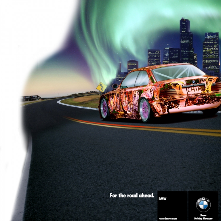
    So I have to finish this up for class on Wednesday, but I need some more ideas. Shoot what you'd like to see. The whitespace is temporary, I am unsure what else to add at the moment, but I need more channels and layers, even though I have about 25 of each at the moment...

    If you suggest something please back it up with detail and even a picture if you got it.

    Enjoy.

    EDIT: I should also mention this was done from scratch. Lots of different pictures all mixed together, and tons of touch ups...
    Last edited by M42Technik; 04-07-2007, 01:49 PM.
    Reminiscing...
  • DEV0 E30
    R3V OG
    • Oct 2004
    • 8828

    #2
    What is the purpose or techniques you are supposed to use? Or is it completely up to you? Is it supposed to be a surreal scene? What are you going to score points with?

    Maybe try to add a subtle race helmet in the car? But the way the light is reflecting off the window it may not be realistic, since you may actually not be able to see his helmet.

    Maybe tech it up with vectors? Not sure what to put in the whitespace, if you just continued the scene I'd like it as is.

    My braintstorming as of now.
    Project: Touring | Project: Unknown | Phoenix, Arizona Events Thread

    Comment

    • E30 Wagen

      #3
      where's the light source?

      Comment

      • M42Technik
        R3V OG
        • Dec 2003
        • 9781

        #4
        The true purpose, pure and simple, is to have the image contain as many channel selections as possible. Thats it, it has to contain at least 20 that are of use (not original selections).

        The light source question is a good one! I guess I need to work on that. As far as the white area, I was thinking the M-Colored flag...the picture is supposed to depict a normal BMW on a starry night that morphs into a track, showing that BMW's are meant for both.

        The art car just worked well with the picture. Thanks for the suggestions, definitely helps!
        Reminiscing...

        Comment

        • ivo316
          E30 Fanatic
          • Oct 2006
          • 1222

          #5
          You might try having the car in the boundary between the track and the street, and have the rear half of the car stock, maybe lasschsilber or blue and the front in "M" colors.

          another 2c.

          Comment

          • T3HCH1LL5
            Banned
            • Apr 2007
            • 50

            #6
            rear looks like a 740

            Comment

            • M42Technik
              R3V OG
              • Dec 2003
              • 9781

              #7


              Update.

              Still not done, due at 8am...

              EDIT: Done now.

              2000x2000 at 150dpi. 59.2 MB, 40 channel selections, 9 group folders, 29 layers, 4 text layers, 20 adjustment layers. This is for my records.
              Last edited by M42Technik; 04-10-2007, 10:01 PM.
              Reminiscing...

              Comment

              • 32.5i
                E30 Fanatic
                • Sep 2005
                • 1336

                #8
                is that the final^? post the final

                Comment

                • M42Technik
                  R3V OG
                  • Dec 2003
                  • 9781

                  #9
                  Originally posted by 32.5i
                  is that the final^? post the final
                  I will when I get home, but the final is not very different from the above. I did fix the M colors on the flag, its light blue, purple, red. On that draft purple came first then light blue...

                  I played with colors in the faces on the art car itself, and that was it.
                  Reminiscing...

                  Comment

                  • backtrail69
                    R3V Elite
                    • Jul 2005
                    • 4471

                    #10
                    That looks really good, my only critique would be the tails... they just look goofy.
                    :: PNW Crew ::
                    '87 325 4dr, '74 2002

                    Comment

                    • M42Technik
                      R3V OG
                      • Dec 2003
                      • 9781

                      #11
                      Originally posted by backtrail69
                      That looks really good, my only critique would be the tails... they just look goofy.
                      Which? The smoked ones? Or the ones with the "light rays" I tried to make? I removed them (shown in 2nd draft), but I did keep the smoked tails.
                      Reminiscing...

                      Comment

                      • apexede30
                        Grease Monkey
                        • Feb 2007
                        • 389

                        #12
                        Jeezus. How did you pull such a thing in photoshop off. I'm stumped how people do this sorta stuff...Anyone know like maybe a link to a few lil tips and stuff so I could atleast have those? I mean look at that ugly sig of mine : P Theres no saving it.

                        '90 325i

                        Comment

                        • M42Technik
                          R3V OG
                          • Dec 2003
                          • 9781

                          #13
                          Originally posted by apexede30
                          Jeezus. How did you pull such a thing in photoshop off. I'm stumped how people do this sorta stuff...Anyone know like maybe a link to a few lil tips and stuff so I could atleast have those? I mean look at that ugly sig of mine : P Theres no saving it.
                          I've been using Photoshop since I was 14, 22 now...Photoshop 4 baby! I take more advanced classes now to understand channel blending and other usages for Photoshop. You have to understand Illustrator to really get ahead though, if you know both you're in good hands...

                          Here is a quick guide for car chops, thats how I got started. This project took me many hours to complete, dunno how many exactly...there are more talented people out there.


                          Go to the Tutorial section, it'll go through step by step. Enjoy!
                          Reminiscing...

                          Comment

                          • apexede30
                            Grease Monkey
                            • Feb 2007
                            • 389

                            #14
                            Thanks! I took computer graphics desgin 1 in college, but then realized how much i hated my teacher. I used illustrator a bit, indesign, whatever. I could NOT proceed to class 2 because I would have to murder her.

                            '90 325i

                            Comment

                            • 32.5i
                              E30 Fanatic
                              • Sep 2005
                              • 1336

                              #15
                              Originally posted by apexede30
                              Thanks! I took computer graphics desgin 1 in college, but then realized how much i hated my teacher. I used illustrator a bit, indesign, whatever. I could NOT proceed to class 2 because I would have to murder her.

                              thats a shame, i hope she didnt steer you away from graphics all together..

                              Comment

                              Working...