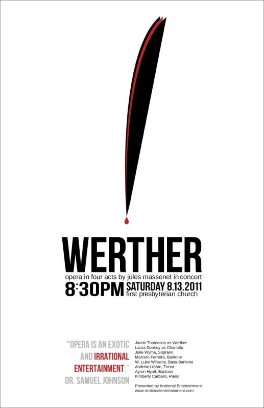
Looking for some design feedback from other graphic designers here! I'm a self taught web designer and have very little experience with print design. Below is my very first poster that I've designed for a friend's new opera company. There is a lot of symbolism in the graphic I created and I'll explain it at the bottom in the hopes at least some of it was conveyed to those who don't know the opera.
Dimensions: 11"x17" @ 300dpi

Graphic Explanation:
The opera is about a love triangle. Charlotte is married to Albert but is in love with Werther. Werther writes a very emotional letter to Charlotte while he is in exile about his impending return for her. One of the high points of the opera is the "letter" aria sung by Charlotte. In the end, Werther kills himself because he cannot be with Charlotte.
The graphic is a minimalist representation of a quill pen. The red stripe in the middle represents Werther, surrounded by Charlotte and Albert. The red droplet is a dual representation of the ink to write the letter and the blood spilled by Werther's death.
Most of the audience will know the basic story of the opera and will know the most about the famous "letter aria" scene.
So What do you think?
Dimensions: 11"x17" @ 300dpi

Graphic Explanation:
The opera is about a love triangle. Charlotte is married to Albert but is in love with Werther. Werther writes a very emotional letter to Charlotte while he is in exile about his impending return for her. One of the high points of the opera is the "letter" aria sung by Charlotte. In the end, Werther kills himself because he cannot be with Charlotte.
The graphic is a minimalist representation of a quill pen. The red stripe in the middle represents Werther, surrounded by Charlotte and Albert. The red droplet is a dual representation of the ink to write the letter and the blood spilled by Werther's death.
Most of the audience will know the basic story of the opera and will know the most about the famous "letter aria" scene.
So What do you think?


Comment