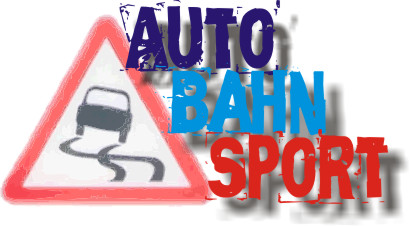
Autobahn Sport needs a logo!!! - contest

Collapse
X
 
  • Time
  • Show
Clear All
new posts

  • Bandit325
    replied
    Originally posted by Purdue89E30
    I shamelessly stole Ritalin Kid's design


    I think that's the perfect logo!:D although I'm not completely sure who should get credit.

    Leave a comment:


  • 325iCabrio
    replied
    Originally posted by Purdue89E30
    I just don't think anybody who hasn't seen this thread already is going to read that as the autobahn symbol. I think the line is unnecessary and makes the symbol look less like a road. It's just confusing.
    I agree. I understand what you're trying to do with the autobahn symbol, but in Purdue's design, it just looks weird, like an autobahn Christian driving camp or something.

    Leave a comment:


  • Purdue89E30
    replied
    I just don't think anybody who hasn't seen this thread already is going to read that as the autobahn symbol. I think the line is unnecessary and makes the symbol look less like a road. It's just confusing.

    Leave a comment:


  • Van Westervelt
    replied
    Originally posted by Purdue89E30
    I didn't make it up so I can't say for sure but I think it's supposed to look like a road, not the autobahn symbol. The letter A is implied by the shape.
    The autobahn symbol is that of a road, hence incorporating it into the logo. It is "Autobahn" Sport afterall. The letter A also has a line in it, implied by the line.

    Leave a comment:


  • Purdue89E30
    replied
    I didn't make it up so I can't say for sure but I think it's supposed to look like a road, not the autobahn symbol. The letter A is implied by the shape.

    Leave a comment:


  • Van Westervelt
    replied
    There is a line in the autobahn symbol, as well as in the letter A

    Leave a comment:


  • Purdue89E30
    replied
    I like the blue and white but i don't get what the horizontal line is for. It looks like a christian cross to me now.

    Leave a comment:


  • Van Westervelt
    replied
    FIXED :)


    My changes:

    Last edited by Van Westervelt; 11-08-2006, 11:39 AM.

    Leave a comment:


  • Lance Racing
    replied
    Even BMW clubs can't legally use the Roundel except in their own club logo.

    Lot's of great ideas presented. I would suggest thinking about where the logo will be used, and if a horizontal versus vertical format logo will suit your needs better.

    For example, a horizontal logo splashes across a letterhead or to a lesser extent, the top of a web page easier.

    Banner ads seem to be horizontal format.

    Business Cards can go either way (hor or vert).

    On the side of an E30 race car: horizontal for sure on the rear quarter panel!

    Leave a comment:


  • Purdue89E30
    replied
    I shamelessly stole Ritalin Kid's design

    Leave a comment:


  • Jand3rson
    replied
    Not bad, but I don't like it nearly as much as your last one. It lost something by changing fonts.

    Leave a comment:


  • Purdue89E30
    replied

    Leave a comment:


  • featuring france
    replied
    photoshop all the way

    Leave a comment:


  • PiercedE30
    replied
    featuring france: what program are you using?

    Leave a comment:


  • PiercedE30
    replied
    Last one for the evening:

    Leave a comment:

Working...