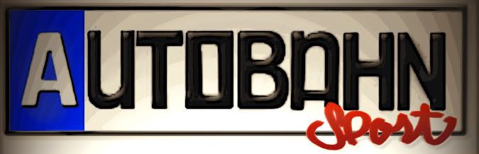
Autobahn Sport needs a logo!!! - contest

Collapse
X
 
  • Time
  • Show
Clear All
new posts

  • featuring france
    replied

    Leave a comment:


  • Jand3rson
    replied
    Originally posted by ivo316
    You can't use BMW emblems, copyright laws prohibit use of them without permission.

    Leave a comment:


  • PiercedE30
    replied
    Looks like it.............should be fun, definitely will be interesting to see the ideas.

    Leave a comment:


  • featuring france
    replied
    lol, i guess this is just a straight up battle now huh?

    Leave a comment:


  • PiercedE30
    replied

    Leave a comment:


  • ivo316
    replied

    Leave a comment:


  • featuring france
    replied

    Leave a comment:


  • 325iCabrio
    replied
    Here's probably the last one I'm going to do--I'm running out of ideas.


    EDIT: Those aren't actually the M colors--they've been tweaked quite a bit, but aren't as Miami Vice-esque as the other colors I was using.

    Leave a comment:


  • Funkmasta
    replied
    I think it might be a little hard to read. I need something that is easy on the eyes. Maybe I am getting old?
    lol

    Leave a comment:


  • Jand3rson
    replied
    That's one of the best yet. I'm torn between that one and Featuring France's europlate theme.

    Leave a comment:


  • asubimmer
    replied
    Originally posted by Purdue89E30
    I'm also a big fan of the one above made by Ritalin Kid, here's nine fixed up a bit:

    even better :drink:

    Leave a comment:


  • RobertK
    replied
    Originally posted by e30 Groupie
    I stilll sorta like this one. Just add a line on the A like the autobahn symbol. Its a bit more professional and gives it a larger company feel.
    Y Thank you.. That's what I was going for. Something professional, catchy, and easy to print on a TShirt or business card.

    I'll see what I can do to sharpen it up some tonight.

    Leave a comment:


  • Purdue89E30
    replied
    I'm also a big fan of the one above made by Ritalin Kid, here's nine fixed up a bit:

    Last edited by Purdue89E30; 11-07-2006, 02:20 PM.

    Leave a comment:


  • Funkmasta
    replied
    Originally posted by e30 Groupie
    I stilll sorta like this one. Just add a line on the A like the autobahn symbol. Its a bit more professional and gives it a larger company feel.
    +1 :p

    Leave a comment:


  • Van Westervelt
    replied
    Originally posted by Ritalin Kid
    I stilll sorta like this one. Just add a line on the A like the autobahn symbol. Its a bit more professional and gives it a larger company feel.

    Leave a comment:

Working...