New Website...Thoughts?

Collapse
X
 
  • Time
  • Show
Clear All
new posts
  • speedhop
    E30 Mastermind
    • Aug 2006
    • 1509

    #1

    New Website...Thoughts?

    I just finished putting together my new site. It is geared towards photo and advertising...hopefully I can impress someone out there.

    Some feedback would be appreciated!

    Thank you.


    ryanwhopkins.com is your first and best source for all of the information you’re looking for. From general topics to more of what you would expect to find here, ryanwhopkins.com has it all. We hope you find what you are searching for!
    www.ryanwhopkins.com
  • kronus
    R3V OG
    • Apr 2008
    • 13000

    #2
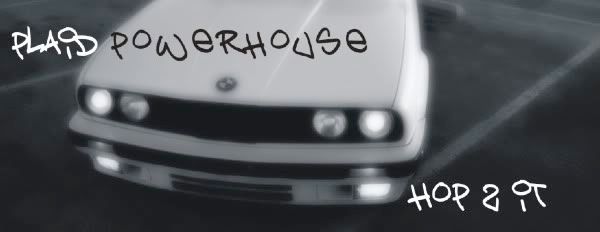
    You need to re-export your logo into some format that doesn't butcher the edges and make jaggies all over.

    Otherwise, good. I generally don't like flash sites, but yours is low-key enough to be good :)
    cars beep boop

    Comment

    • speedhop
      E30 Mastermind
      • Aug 2006
      • 1509

      #3
      I've been noticing that...3rd time saving as a transparent png and still this. hmmm

      Thanks for looking!
      www.ryanwhopkins.com

      Comment

      • kronus
        R3V OG
        • Apr 2008
        • 13000

        #4
        You could try toning down the outer glow and shadow combination... are you exporting out of Photoshop or Illustrator?
        cars beep boop

        Comment

        • shmutzigE30
          E30 Mastermind
          • Oct 2008
          • 1680

          #5
          looks great but runs a little slow. for me at least but i have an extremely fast connection sooo...... yea

          nice lookin site though
          AW 89' 325i Vert - SOLD

          Comment

          • speedhop
            E30 Mastermind
            • Aug 2006
            • 1509

            #6
            I exported out of photoshop.

            Edit: I toned down the outer glow, saved as bicubic smoother, and re-exported and still some text clipping.
            Last edited by speedhop; 04-09-2009, 05:23 PM.
            www.ryanwhopkins.com

            Comment

            • kronus
              R3V OG
              • Apr 2008
              • 13000

              #7
              And are you working at 2x or 3x production resolution?
              cars beep boop

              Comment

              • speedhop
                E30 Mastermind
                • Aug 2006
                • 1509

                #8
                Bingo...well better at least.

                I was working at poop level resolution.
                www.ryanwhopkins.com

                Comment

                • 32.5i
                  E30 Fanatic
                  • Sep 2005
                  • 1336

                  #9
                  very well done.. you definitely have some talent.. hope it gets you somewhere !

                  Comment

                  • spooledtt
                    E30 Addict
                    • Jun 2008
                    • 420

                    #10
                    Flash usually pisses me off but i think yours looks pretty good. But your logo just doesn't look right.

                    Comment

                    • markseven
                      R3V Elite
                      • Sep 2006
                      • 5327

                      #11
                      Why does the logo need a transparent bg?
                      I Timothy 2:1-2

                      Comment

                      • aintnothang
                        Mod Crazy
                        • Aug 2008
                        • 743

                        #12
                        simple and effective.

                        Comment

                        • speedhop
                          E30 Mastermind
                          • Aug 2006
                          • 1509

                          #13
                          Originally posted by markseven
                          Why does the logo need a transparent bg?
                          Because it's a pain in the ass to try and color match. Transparent png's are more versatile and effective.

                          Originally posted by aintnothang
                          simple and effective.
                          Just what I was going for. Thanks.
                          www.ryanwhopkins.com

                          Comment

                          • Reign
                            Advanced Member
                            • Nov 2008
                            • 125

                            #14
                            props bro. I think the gray background should be a lighter shade for a better look. That's just my opinion though.
                            '91 318iS

                            Koko's Garage - BMW and Mercedes Specialists
                            651 Mount Auburn St, Cambridge, MA, 02138

                            Selling This Car:
                            http://r3vlimited.com/board/showthread.php?t=132392

                            Comment

                            • markseven
                              R3V Elite
                              • Sep 2006
                              • 5327

                              #15
                              Originally posted by speedhop
                              Because it's a pain in the ass to try and color match. Transparent png's are more versatile and effective.
                              Apparently not :p

                              I really like the nature shots, btw.
                              I Timothy 2:1-2

                              Comment

                              Working...