Announcement

Collapse
No announcement yet.

A New R3v

Collapse
X
 
  • Filter
  • Time
  • Show
Clear All
new posts

    A New R3v

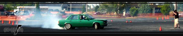
    Not in any way that matters.

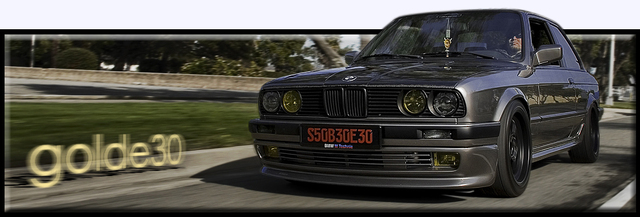
    I decided to start up that rough drafting of designs. It will be centered on your screen, yada yada. What you like from one and another, yada yada.

    Jeremy gets his 15 mins of fame cuz he kept the fonts coming that looked good. Final pic is what it's looking like that we think is good, you choose.


    ======================================


    ======================================
    Last edited by DEV0 E30; 11-04-2005, 11:57 PM.
    Project Thread | Instagram | Phoenix, Arizona Events Thread

    #2
    May have a rotating/random header so the pic of the tach doesn't get old.
    Project Thread | Instagram | Phoenix, Arizona Events Thread

    Comment


      #3
      Blade Runner style for sure.

      Comment


        #4
        last one defenitely bbut with the design of the car behind the text as in the first one.
        HDE30 <3

        Comment


          #5
          Updated with more ^^^^^^^^

          1)


          2)

          Project Thread | Instagram | Phoenix, Arizona Events Thread

          Comment


            #6
            And I recall someone saying that logos didn't look good in black... Like I said it just takes good web design to back them up.

            Good job!!

            Comment


              #7
              Originally posted by eightyfoure
              May have a rotating/random header so the pic of the tach doesn't get old.
              Wouldn't rotating through pics of it make it get old quicker. :D
              sigpic

              Comment


                #8
                I like the 6th one down.
                Current Cars
                2014 M235i
                2009 R56 Cooper S
                1998 M3
                1997 M3

                Comment


                  #9
                  I like the logo font on the first 3 designs.

                  looks very good!
                  Build thread

                  Bimmerlabs

                  Comment


                    #10
                    Originally posted by nando
                    I like the logo font on the first 3 designs.

                    looks very good!
                    I'm with Nando, and I LOVE the "Bitches" text next to the car, have to keep that.

                    I also like #6, like Dave said.

                    Comment


                      #11
                      number one for the win
                      https://www.youtube.com/channel/UC-h...wE3UqwjjmaTrXg

                      Comment


                        #12
                        Lookin good D-Evo.

                        Use a rotating banner or something along those lines.
                        91 m3

                        Comment


                          #13
                          Friken sweet. Rotate them all.

                          Comment


                            #14
                            how about number 9 with number 8 lettering...
                            IG: @Baye30

                            FRONT VALENCE IS ZENDER!!! STOP FILLING MY PM BOX PPL!!!

                            Comment


                              #15
                              Damn, quite a few different tastes. I'll remember to do a quick rotating script so it doesn't get "old" looking and what not.
                              Project Thread | Instagram | Phoenix, Arizona Events Thread

                              Comment

                              Working...
                              X