M Technic logo

Collapse
X
 
  • Time
  • Show
Clear All
new posts
  • Farbin Kaiber
    Lil' Puppet
    • Jul 2007
    • 29502

    #16
    Color codes are of the Pantone, almost the industry standard swatch book.

    Comment

    • MikeK
      R3VLimited
      • Jan 2005
      • 2771

      #17
      Originally posted by Farbin Kaiber
      Color codes are of the Pantone, almost the industry standard swatch book.
      that almost sounded like you had a job :rofl: <3Farbin
      Toyota Pickup

      Comment

      • Farbin Kaiber
        Lil' Puppet
        • Jul 2007
        • 29502

        #18
        tee hee.

        Comment

        • DuHast
          Advanced Member
          • Apr 2009
          • 122

          #19
          I could attempt to re-create it in Adobe Illustrator if need be. What is it going on? A screen based graphic or a print application? I've got a degree in graphic design and this seems to be a pretty straightforward design

          Tim
          1991 318is

          Comment

          • YAN-3
            R3V OG
            • Jan 2004
            • 6018

            #20
            Originally posted by DuHast
            I could attempt to re-create it in Adobe Illustrator if need be. What is it going on? A screen based graphic or a print application? I've got a degree in graphic design and this seems to be a pretty straightforward design
            do it.

            Comment

            • guibo09
              E30 Modder
              • Dec 2008
              • 834

              #21
              here is my attempt. took alot more effort than i thought, helvetica is not a good match for the e and c.

              90 E30 325i

              Comment

              • guibo09
                E30 Modder
                • Dec 2008
                • 834

                #22
                no comments on my logo?
                90 E30 325i

                Comment

                • bachian8
                  Noobie
                  • Mar 2009
                  • 20

                  #23
                  looks like a close match. i think the red should be a shade darker tho.
                  "i'm too drunk, to taste this chicken." - colonel sanders

                  Comment

                  • YAN-3
                    R3V OG
                    • Jan 2004
                    • 6018

                    #24
                    Originally posted by guibo09
                    no comments on my logo?
                    its a bit off the middle darker blue should be thicker. all of them are the same hight. if that makes sense.

                    Comment

                    • reelizmpro
                      R3V OG
                      • Dec 2003
                      • 9462

                      #25
                      The colors aren't supposed to be even, infact the red isn't high enough. It's supposed to line up with the bottom part of the horizontal part of the 'e'. The light blue stops at the top of the horizontal part of the 'e'. I have a badge right here in front of me. So basically, just shift everything upward a bit until the colors line up with the 'e'. This is how it is on the original badge with raised letters.
                      Last edited by reelizmpro; 06-17-2009, 12:29 PM.
                      "I'd probably take the E30 M3 in this case just because I love that little car, and how tanky that inline 6 is." - thecj

                      85 323i M TECH 1 S52 - ALPINEWEISS/SCHWARZE
                      88 M3 - LACHSSILBER/SCHWARZE
                      89 M3 - ALPINEWEISS II/M TECH CLOTH-ALCANTARA
                      91 M TECHNIC CABRIO TURBO - MACAOBLAU/M TECH CLOTH-LEATHER

                      Comment

                      • guibo09
                        E30 Modder
                        • Dec 2008
                        • 834

                        #26
                        Originally posted by reelizmpro
                        The colors aren't supposed to be even, infact the red isn't high enough. It's supposed to line up with the bottom part of the horizontal part of the 'e'. The light blue stops at the top of the horizontal part of the 'e'. I have a badge right here in front of me. So basically, just shift everything upward a bit until the colors line up with the 'e'. This is how it is on the original badge with raised letters.
                        you're right, didnt notice but the two official badge pictures posted on page 1 are slightly different in that regard.

                        i actually think it will look better the way you suggest. i will change it that way.

                        does the letter spacing/thickness look right?
                        90 E30 325i

                        Comment

                        • YAN-3
                          R3V OG
                          • Jan 2004
                          • 6018

                          #27
                          Originally posted by reelizmpro
                          The colors aren't supposed to be even, infact the red isn't high enough. It's supposed to line up with the bottom part of the horizontal part of the 'e'. The light blue stops at the top of the horizontal part of the 'e'. I have a badge right here in front of me. So basically, just shift everything upward a bit until the colors line up with the 'e'. This is how it is on the original badge with raised letters.
                          Barry what I meant is that each color is the same amount, the top color starts from the top of the T and thats why it seems like there is only a little when it come down to the e,h,n,i,c

                          Comment

                          • DuHast
                            Advanced Member
                            • Apr 2009
                            • 122

                            #28
                            Just got home from work. I'm going to take a stab at this logo for you now

                            Tim
                            1991 318is

                            Comment

                            • DuHast
                              Advanced Member
                              • Apr 2009
                              • 122

                              #29
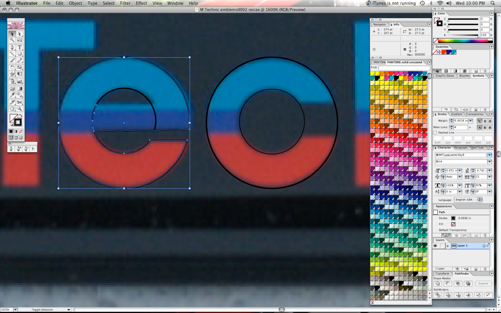
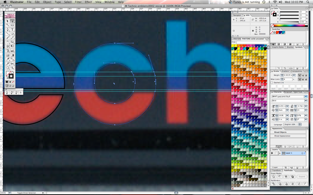
                              Upon closer inspection, I found that one of the reasons the re-created versions up to now don't look right because of the rounded lettering. Helvetica's lettering in the circular forms do not match up no where close. I had to recreate the "e" and "c" with actual circles, then cut some points off the circles and re-joined them to make the individual letters. The tail on the "e" doesn't actually line up with the corresponding tail of the "c" either as you'll see below. Also done with the "n" and "h". The hump on those letters is actually a bezier curve at the top and a circle cutout below. Here's what I mean.


                              Final Product Screen Shot


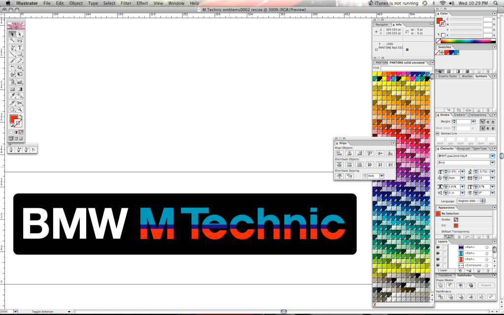
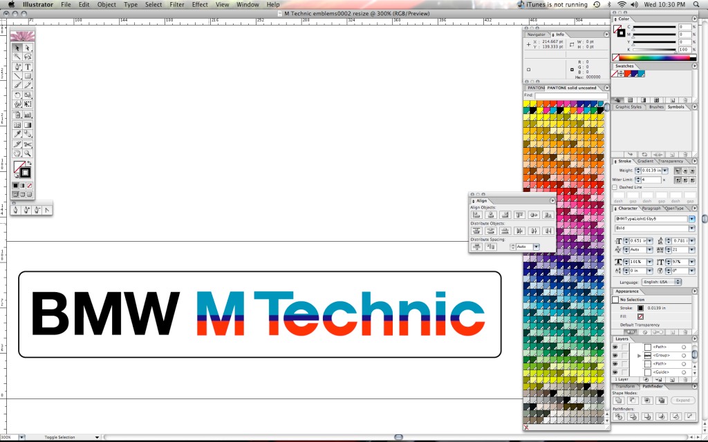
                              Keep in mind, this does look different on the forum post as opposed to my screen in Adobe Illustrator. The colors are slightly different going from Pantone Process coated to the RGB Scale that is present in the conversion from an EPS to a JPG suitable for internet format.

                              I can send people the EPS files directly. Don't copy and crop the pics I uploaded as I've touched up a little more since this post I'm sure.

                              That'll be $125 for logo recreation and a free T-Shirt from the OP. :D

                              Enjoy!
                              Tim

                              Tim
                              1991 318is

                              Comment

                              • guibo09
                                E30 Modder
                                • Dec 2008
                                • 834

                                #30
                                good work! i did the same thing tho, i recreated the e and c from circles. our logos look pretty much identical.

                                however, check out the first actual badge picture of this thread. the way the lines are striped is slightly different. the entire horizontal line of the e is dark blue. can you do it that way? i think it would look better.

                                send the .eps to philipb9 yahoo.ca, please! thanks
                                90 E30 325i

                                Comment

                                Working...