
I like the "old school" E30 one better with the entire horizontal line of the 'e' dark blue like the emblem in post #1. It also flows much better with the openings of the letter 'C' being the same thickness as the horizontal line of the 'e'. The second emblem pictured in post #12 is a newer emblem so I guess both ways are correct. If someone comes up with the finished art I can run the idea to a friend who has a silk screening business.
-
-
You guy's are talented!! Nice work................[IComment
-
If this becomes a tshirt, do fucking want.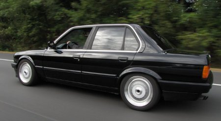
SC*AR (Schwarz Army)
No longer stock ride height, rolling as low as a daily driver in New England should without worrying about breaking an oil pan. :up:Comment
-
Tim is the MAN!!! now when can we expect these shirts? I say he gets one for free!Comment
-
I second that notion! Took about 3 hours total to get it that way... could charge ya $150 or 1 shirt lol :hitler:
Tim
1991 318isComment
-
my plan was never to make t-shirts to mass sell. i just wanted to make a one off for me. im in canada remember, shipping would not be that interesting to you guys.
but if anyone is willing to pay about 35$ for the t-shirt...90 E30 325iComment
-
Comment
-
Yan-3 I'm in the process of vectorizing my car as well... I'd like to find a screen printer to have that put on a shirt. 4 hours into this so far and this is as far as I've gotten. (Keep in mind, each point is 1 mouse click lol)
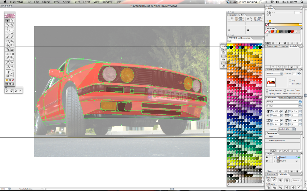
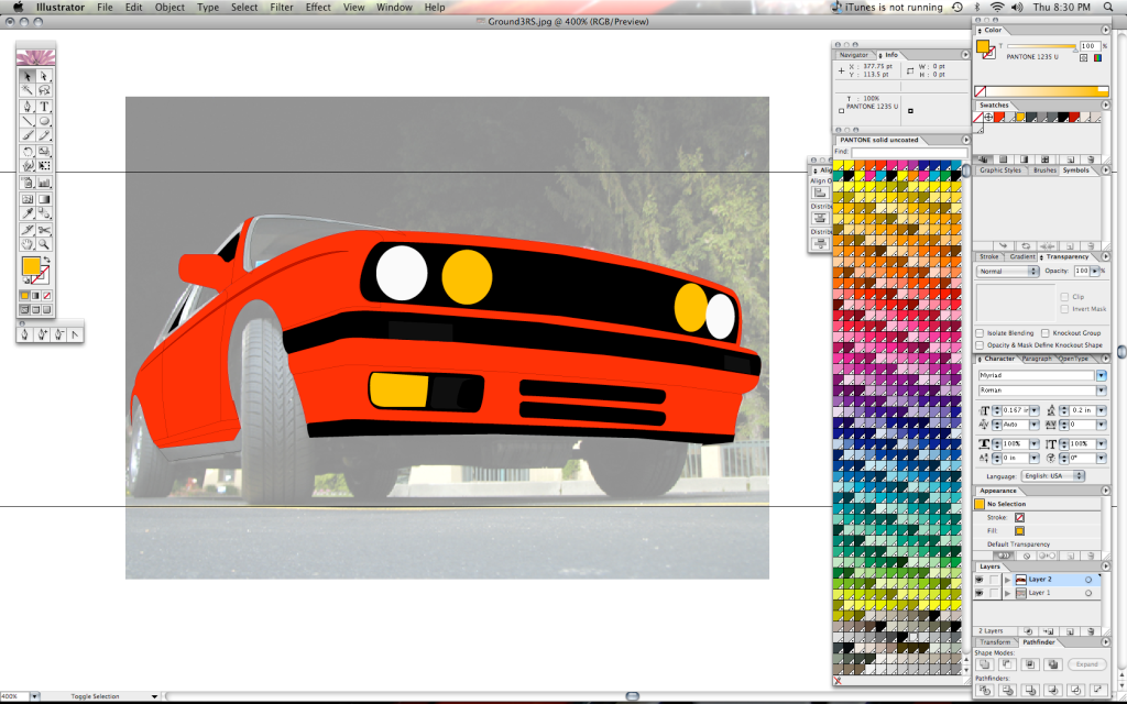
Tim
1991 318isComment
-
probably another 4-6 hours to go just to get all the panels completed. Add touch up and finalization on top of that. Would like to get the 318 vector to the level of this one I did of my Camaro that I had a few years ago. 15 hours total on this one.
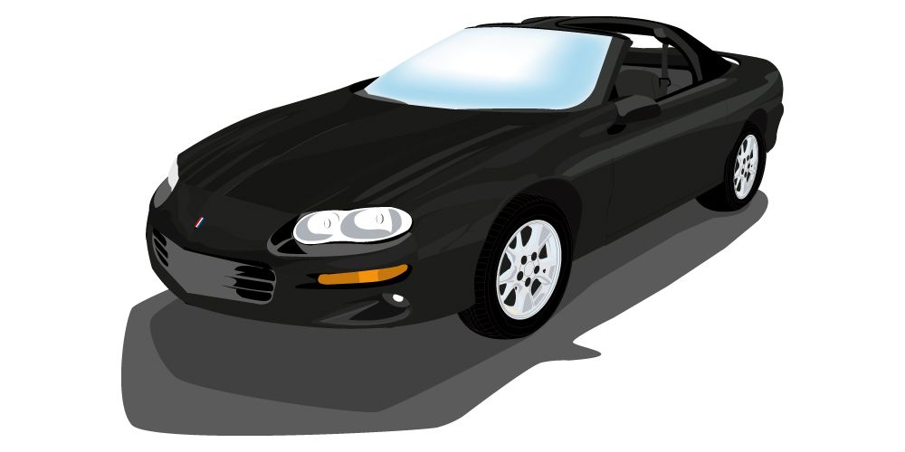
Tim
1991 318isComment
-
i was gonna have the t-shirt digitally printed here:
90 E30 325iComment


Comment