
i like the site, nice work.
-
I really like the layout but I'm not too sure about the colors.
Nature section is your best shots imo.Originally posted by z31maniacComment
-
Comment
-
Like the site, and the pics.Comment
-
-
Looks good, overall design is nice and neat. I would create slightly larger thumbnails for better navigation, it's kind of difficult to see what the user is selecting.
Logo needs to be less web 2.0. You have a LOT of different techniques trying to be accomplishes in a very small canvas, I would get rid of the drop shadow, and the "bling" light reflections. Also you're going to need to create a much higher resolution image and kerning in order to clean up the main text in your logo, it'll get rid of that pixelation.
You should probably think about using a different shade of yellow for the navigation text. I understand your need for stark contrast but it also makes it somewhat hard to read depending on the browser.
What browsers did you test this in btw? I love using www.broswershots.com to give me a good reference for all the available browsers.
Did you build the entire thing yourself or did you use a template? either way it looks really good and you have a great start towards a clean website.
There are a few css and flash hacks that will take care of the trans .png problems in IE6 & 7. Check out www.w3schools.com for more information.Comment
-
Comment
-
nice site keep up the good work.84 ETAComment
-
Ive seen a lot of photog/graphic designer sites, and being one my self, I can say it's simple and to the point. The spinning record in the corner with no music playing is a little odd, try taking that out of the template.
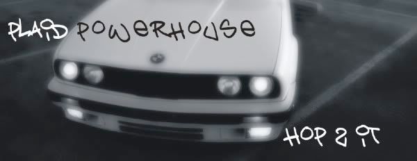
I would suggest dropping most of the shots of your e30, there are a lot in there. I generally try to, and usually see, no more than 3 shots of the same car and if you absolutely need to show more do a collage or triptych.
Just my constructive feedback, Im in the process of a site overhaul my self and haven't post it any where for crit yet.
Photo Q: Any reason you have your lights in the frame for some of the automotive shots?Comment
-
sumyungguy...thanks for the feedback. It is much appreciated!
I know exactly what you are saying about the automotive section...i'm thinking I might just merge the automotive with the landscape. All of the people I knew had shit cars (not saying that mine looked any better) or didn't have cars and would not be worth photographing.
I will also looking into seeing if I can get rid of that damn record spin. It's obnoxious and I hate it when a site has music.
The reason I leave lights in for some of the shots is because at the time it was like my calling card...if it was a BMW or had a light in it people immediately knew it was mine.Comment
-
If y'all are looking for a good place to get critiques on your websites, check out www.estetica-design-forum.com. It's a UK based forum but the other designers there are great and the skill level ranges from beginners to established big wigs. I use the site for just about everything.Comment

Comment