
I think the roundel needs more of a finished look, like maybe round the edges a little, and give it more of a 3D look.
-
-
number once since 8 has a black backround and everything else on this forum is whiteComment
-
noOriginally posted by Slick92GS-RComment
-
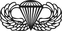
.Originally posted by Eurospeed88173rd ABN
Comment
-
.173rd ABN
Comment
-
-
..173rd ABN
Comment
-
Now we're talkin!Originally posted by Bokes
You sure the right blue would be a copyright infringement on that particular design?
Law guys?Comment
-
-
My vote goes to the blue one.
Legality shouldn't be an issue, since the design isn't even really round, doesn't say BMW anywhere, and the only similar characteristic is shares with a roundel is that it's divided into 4 segments, there should be no problems.Comment
-
numbrah one or numbrah eight, I like them both, need new decals to go with new logo, someone has to get to cutting that vinyl once we have decided.Comment
-
Bokes, the red outline looks disgusting as in bad on the logo, the ones without it look okay. I prefer design #6 above all others. That is ofcourse if we stick with this forum design. I think that 6 matches best with this current theme and looks damn good doing it.PNW E30 CREW ///
Comment
-
-
i picked 3, and i think the ones with the tach would look better if the needle was at 7000 or pastComment
-
matt liked the red bordered one so i made a red bordered one. i made a non outlined one also because i personally like it with no outline.Originally posted by Nathan173rd ABN
Comment


Comment